Fungi
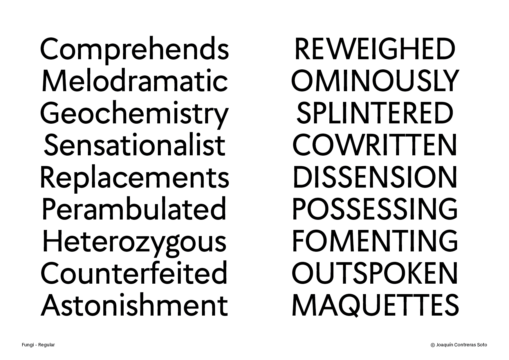
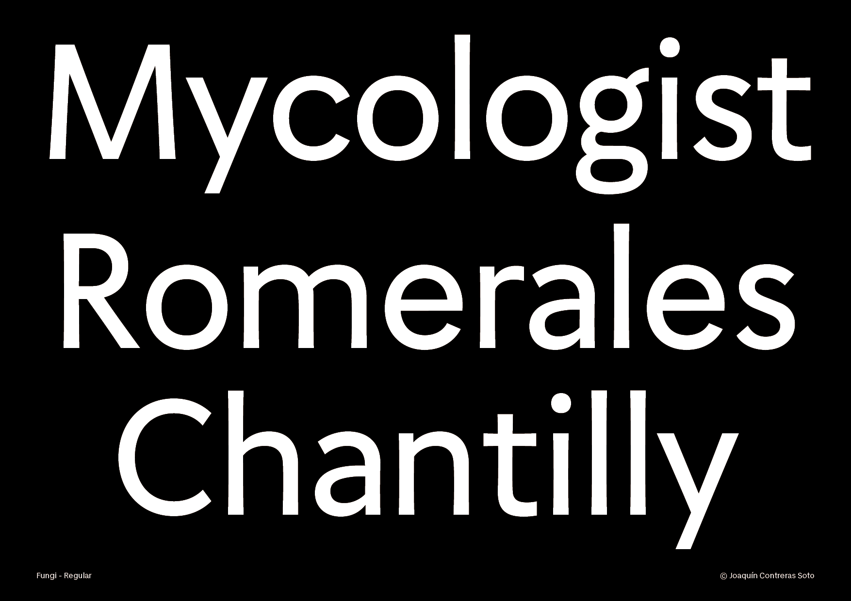
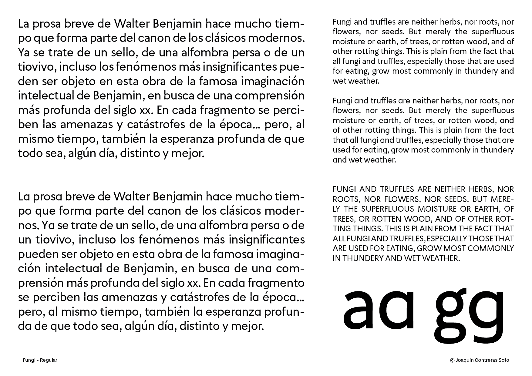
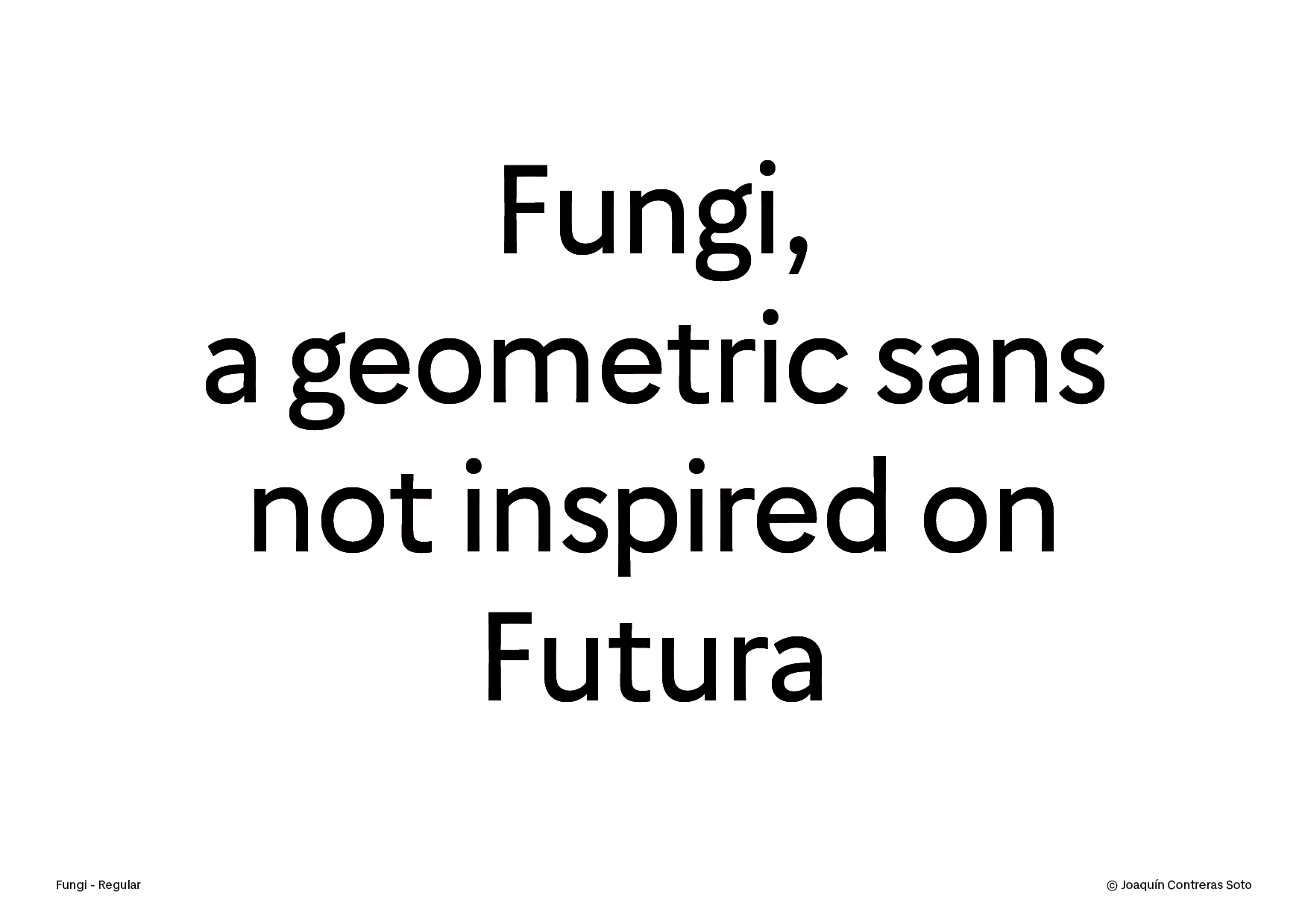
As a type designer the challenge of making a geometric sans that is warm in paragraphs of text is one of the most interesting ways to find a personal hand. The difficulty of the elementary structure plus the monolinear strokes gives you an idea of your essential taste. what were the first books, posters or school writing that marked you? Was it the lettering on a school bus, the logo of a toy, a poster in kindergarten?
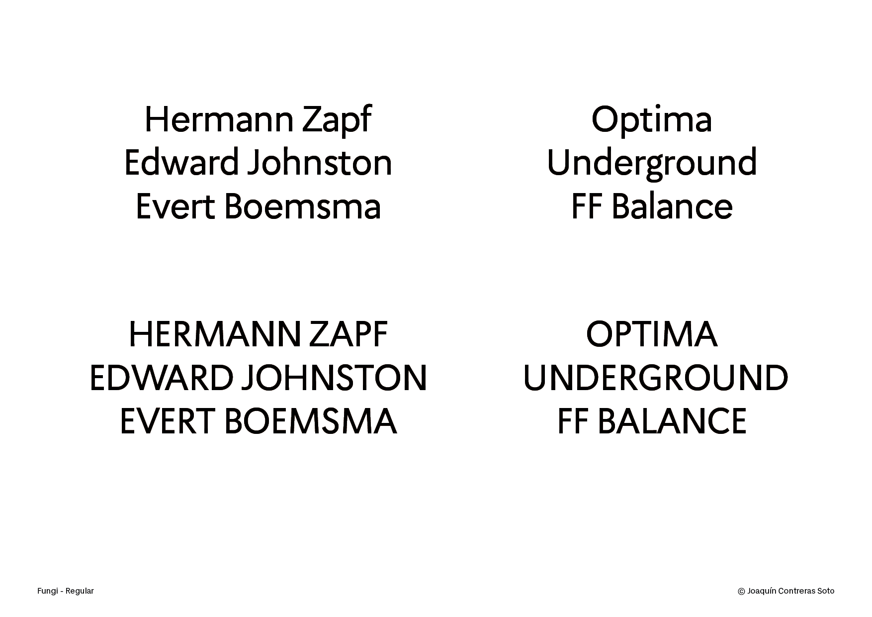
These types of fonts are recognizable with a couple of classics: Futura, Gill Sans and the more recent Gotham. What I want to do is to go a little deeper by starting from scratch and going to the originals. I mean from Roman imperial capitals to William Caslon’s two-line English Egyptian, and looking more at Edward Johnston than Eric Gill.
On the other hand, one of my favorite designers is Hermann Zapf, his calligraphic compositions are impressive and his type proportions are clean and elegant. I take some ideas from his lettering and his classic Optima typeface.
For the lowercase I am adapting the “unitized” model of my Arche in the basic modules (nobdpq, etc) for a uniform texture in the paragraphs.
Another important reference is the work of Dutch type designer Evert Bloemsma, his FF Legato and FF Balance fonts are great sans serifs, the optical effects in their inverted contrast and the slight curvature in the strokes are quite warm and natural.
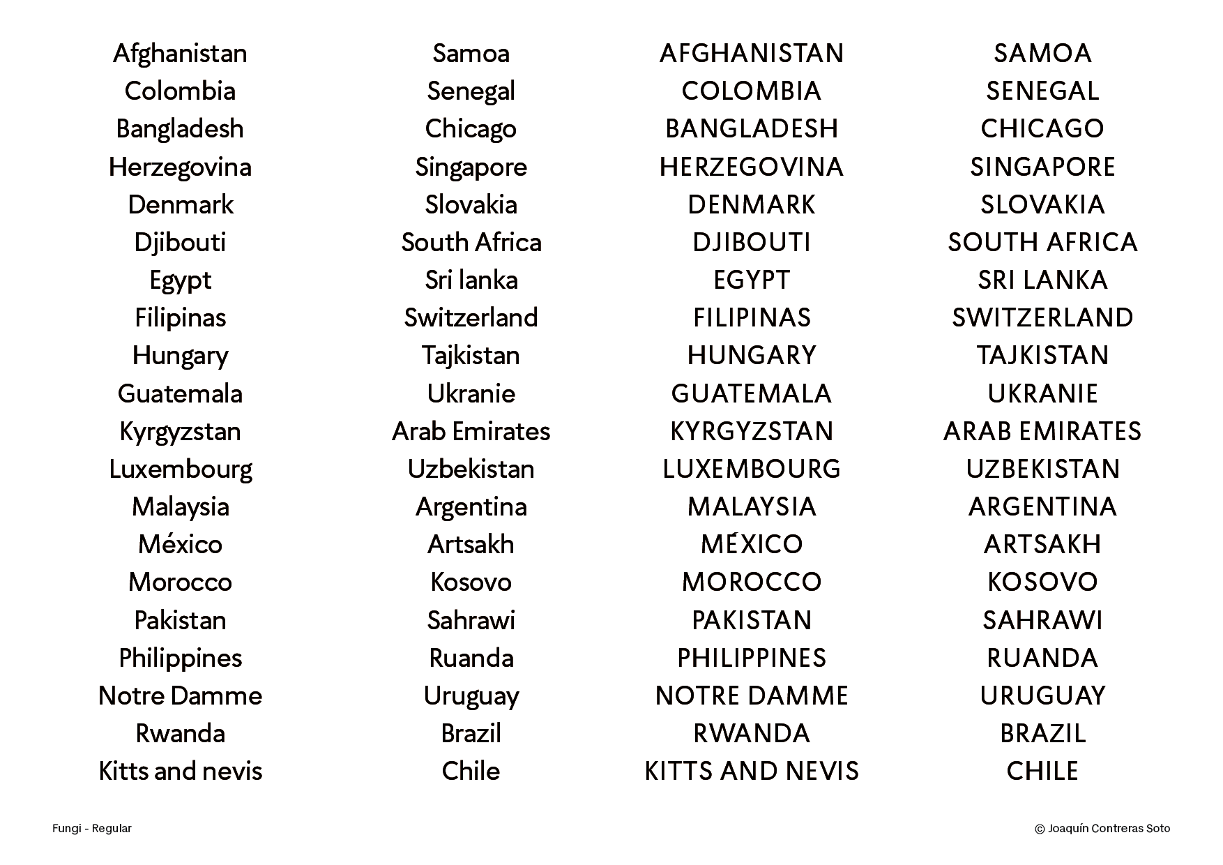
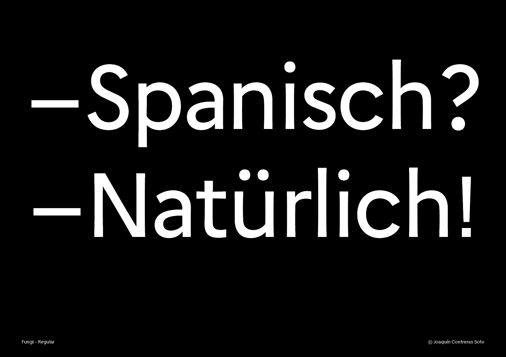
At the moment I only have a regular version, a cut that I am working on in detail in its proportions, spacing and diacritics. My plan is to extend the diacritics to full Latin, i.e. Pan-African, Eastern European and Asian that use the Latin alphabet, a little more than 600 glyphs.
